Preattentive Processing and Early-Stage Perceptual Organization
Introduction
Human visual system is bombarded with stimuli every moment of its waking life. If all that information is allowed to be processed at the same time, it could overburden the brain and lead to a state of confusion (Treisman, 1982). Therefore, it is crucial for our visual system to quickly make sense of the world without consciously devoting cognitive attention to every element in the visual field. This is the underlying idea behind preattentive processing.
Preattentive processing may be described as the background activity that precedes conscious mental activity. Typically, it is agreed that any visual task that can be completed on a large multi-element field of vision in less than or equal to 250 milliseconds is considered preattentive. This limit is proposed because the human eye movement takes at least 200 milliseconds to initiate (Healey, Booth, & Enns, 1996). From an evolutionary perspective, too, preattentive processing has been an asset that has made humans more efficient and helped them in identifying threats (Öhman, 1997).
Although attempts to explain how such a process improves the efficiency of visual processing was made earlier by Gestalt psychologists like Wolfgang Köhler and Max Wertheimer, the effort lacked a neurological basis (Rock & Palmer, 1990; Treisman & Gelade, 1980). The research that laid the foundation of the present interest in preattentive processing came from the seminal works of Anne Treisman. She stated that preattentive processing occurs at a stage before conscious awareness and also proposed the feature integration theory (Treisman & Gelade, 1980; Treisman, 1985). This has proved to be a watershed.
This paper is divided into two parts. The first part primarily explores the physiological and neurological foundation of preattentive processing. Building on this foundation and by understanding feature integration theory, we shall examine how humans group and organize objects. We shall also briefly survey various dimensions like similarity, common region, proximity, and alignment that can help designers and users group different elements for preattentive processing. Based on the theoretical understanding explored in the first part, the second part of the paper will provide a science-based design review of the Social Security Administration website (http://www.ssa.gov).
Physiological and Neurological foundation of Preattentive Processing
According to Krauzlis and Stone (1999), “When viewing their visual surroundings, primates use a combination of saccadic and smooth pursuit eye-movements in order to center and stabilize the retinal images of objects of interest.” Saccade is a French word meaning fast movement like the flick of a sail. It refers to discrete movements of the eye ball as directed by the brain to quickly focus the line of sight towards a target, thereby moving the light from the object to the reach the high-attention region of the eye (Deubel & Schneider, 1996).
Once a light signal from the outside world arrives at the retina, it does not encounter a uniformly sensitive surface. There is a small depression-like surface somewhere in the focal center of the macula of the retina called the fovea. This is the most sensitive spot of the retina packed with cones (responsible for chromatic vision). The light sensitizing the foveal region is responsible for the sharp central vision of the object the eye is focused on. Although preattentive processing happens intuitively and does not involve conscious focusing of attention, it still follows the same channels.
The light falling on the photoreceptors is converted into electrical impulses by a process known as transduction. These impulses are then carried by retinal ganglion cells (RGCs) or the output neurons of the retina. The area of retina surrounding the fovea responds by comparing different intensities of light, thereby helping RGCs to detect edges in the field of vision (Marr & Hildreth, 1980). The axons of the RGCs bundle together to form the optic nerve and the signal reaches the optic chiasm, where the nerves cross. As a result, the image activated on each retina gets transmitted to the opposite side of the brain (Gregory, 1973). This region of the brain is called the lateral geniculate nucleus (LGN). A six-layered structure, the LGN is considered the gateway for sensory information to enter the visual cortex. The layers alternate inputs from two eyes. While four dorsal layers are called are parvocellular (small-cell) layers, the two ventral layers are called magnocellular (large-cell) layers (Livingstone & Hubel, 1988). While magnocellular layers have high contrast sensitivity and are not color selective, parvocellular layers are color selective and have low contrast sensitivity (Hubel & Livingstone, 1990).
LGN neurons convey their axons to V1 and V2, the intermediate layers of the primary visual cortex. The visual processing in the cortex is hierarchical. (Lennie, 1998). LGN sends most of its axons to V1, making it the first visual processing area in the cortex. The signal is then passed on to V2. Viewed from the perspective of Gabor’s model, both V1 and V2 cortical sections are adapted in a way that the neurons present therein can filter orientation and size information (Barlow, 1972). In addition, these neural centers are also sensitive to different luminance patterns. While V1 is attuned to detect and encode line orientation and spatial frequency of lines and colors, V2 is sensitive to angles or curvatures and spatial orientation of contours (Krauzlis & Stone, 1999). V1 and V2 besides being the first to receive visual impulses also are responsible for about 40% of vision processing (Lennie, 1998). It is believed that it is in these lower cortical layers that bottom-up preattentive processing occurs (Grossberg, 2001).
Feature Integration Model and How We Group Objects
Neurological and physiological evidence, as explained above, suggests how different properties like orientation, lines, colors, contours, etc., are preattentively mapped in different areas of the brain. Preattentive processing involves quick, non-conscious processing of the entire visual field and the elements therein in order to discern patterns. However, instantaneous and subconscious processing can only be efficiently possible if there are features in the elements of the visual field that enable it. According to the feature integration theory of attention: “features are registered early, automatically, and in parallel across the visual field, while objects are identified separately and only at a later stage, which requires focused attention” (Treisman & Gelade, 1980).
Features that pop out and are registered automatically are used by the brain to draw immediate groupings and to make sense of the visual field without even allocating attention or conscious cognitive effort (Julesz & Bergen, 1983; Treisman & Gormican, 1988). Such grouping can lead to what is known as feature maps. It is these constructs that are used by the brain to view patterns and to improve visual processing speed. Since preattentive processing is concerned with defining elements that pop out, it is involved in actively forming groups. These groups can be identified based on proximity, common region, alignment, and similarity in color, size, and shape.
As pointed out by Pomerantz and Schwaitzberg (1975), elements can be grouped on the basis of closeness or proximity. Proximity depends on the relative distance between two elements. When the distance between two elements is insignificant or less, it is considered to be part of the same group. Whereas, when the relative distance between two elements is more, it is preattentively perceived as two distinct groups.
Palmer (1992) put forth the idea that elements are seen as a group if they are placed within a common region or space. We perceive objects located within an enclosed space as a group. White space, borders, outlines, and similar color backgrounds can be used to define and separate regions.
Alignment or good continuation is another important element of perceptual organization. It is easier to follow edges or continuous alignment of similar elements when they are placed together (Fellenz and Hartmann, 1996). As seen earlier, the V1 and V2 parts of the visual cortex are sensitive to line orientation and edges or contours, and therefore good continuation or alignment helps group areas preattentively.
Another important grouping criterion in preattentive processing is similarity. It is likely that elements that share similar visual characteristics like size, shape, or color would be grouped together. Gestalt psychologists, however, have observed that grouping by similar shape is more evident than grouping based on similarity in color. Although this finding does not have a neurological basis, it has been testified by certain experiments (Rock & Palmer, 1990).
Conclusion
Since gaining acceptance in the mid-1980s, the concept of preattentive processing has been studied by different scholars and researchers. It has found application in different fields such as boundary detection, rapid size/count estimation, and target detection. By understanding the physiological and neurological aspects of preattentive processing, designers can produce better designs that draws the attention of users exactly where needed. This will also help in optimizing visual design to closely align it with the fundamental neurological processes that trigger preattentive processing.
Social Security Administration: A Science-Based Design Review of ssa.gov
Social Security has provided financial protection to American people for more than eighty years. Among various other facilities, the https://www.ssa.gov website is used by people to check their application status, manage their social security benefits, and apply online for Medicare. The purpose of this design review is to examine how a first-time user would preattentively view the social security administration website. This review will include a study of various dimensions like proximity, similarity, region, and alignment to examine the homepage of ssa.gov. It will also include design recommendations that could improve how this website is viewed preattentively.
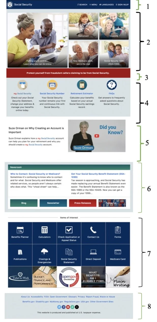
When viewed for the first time, a user can distinctly divide the homepage into 8 main sections as illustrated above. All these regions are aligned horizontally. The sharp horizontal alignment defines the different sections of the homepage. Since the V1 and V2 parts of the brain are sensitive to edges and line orientation, these sections can be easily discerned preattentively. What makes the first four groups distinct from one another is their different background colors and proximity of elements. However, in the last four groups, white space is used to create these distinctions. Since white space is the least intrusive, it would make sense to use it to segregate all the groups. This would ensure uniformity and it would be much easier for a new user to group things preattentively.
On the homepage, there is no similarity between the color of links or the color of buttons. In some instances, blue color is used for links while, in others, white is used. This inconsistency is not useful as a user would not be able to preattentively distinguish links from normal text. It would have been better if all the links were of a similar color.
Let us now discuss how a new user would preattentively perceive each of these eight sections on the homepage of www.ssa.gov.

The top navigation bar, as seen above, demonstrates the qualities of proximity and similarity. The text on the right can be grouped together because of its proximity and also similarity in size and color. The text on the left, although in the same color, is in a bigger font. This makes it pop out and helps a user notice it. However, all the text in the navigation bar is enclosed within a contour or a common region, and therefore it is preattentively seen as a group.

All the elements in this section of the homepage are grouped together or in close proximity. Although a new user would perceive this as a group, the bigger image on the left would draw his/her attention first because of its size. It would pop out. Moreover, all the four images on the right would be grouped together as one because of the similarity in their size. The proximity of all the images makes a user perceive it as a common region. For a new user to perceive these images as different buttons, the space between each image should be increased. Using white space between pictures can also help make them stand out. As of now, the images almost merge with the background and appear as a group rather than separate elements.

This warning message is seen as a separate group because of its luminance contrast compared to the background. Since the overall color scheme of the homepage is muted, the red background color pops up. Although this is a good way to draw a user’s attention, a colorblind user might see it just as a button or bar instead of a warning sign.

Overall, this a well-designed section. The lack of proximity (spacing between the four sections) allows a user to preattentively perceive the elements in this section as four different groups. Equal spacing and similar icons size helps distinguish each group. However, the color and size of the font used in for the first icon is different from others. The color is subtle and does not pop out. To maintain similarity, it would make sense to use the same font color and size for all the four groups. If the purpose is to attract attention to “my Social Security”, it would be useful to differentiate it from the others by using a larger icon or increasing the font size. Using a different font color with better contrast would also make it stand out.

In this section, “my Social Security” pops up because of its similarity in color (blue and red). These words can be easily detected preattentively. The video can also be easily distinguished from the text on the left. Moreover, the text on the video would immediately draw attention because of its large size and bright color. However, it would make sense to group the text and video closer together. As of now, the white space makes the text look like it not related to the video. Reducing the white space, using a common background color, or using a border would make it appear as part of the same group.

All the buttons in this section are located in the same region. They are also the same shape and size. This makes it easy to find the buttons preattentively. However, all the buttons are of different colors. This makes them appear like they somehow belong to different groups. The background color of the heading “newsroom” and the button “blog” is the same. Even though there seems to be no connection between the two, a new user might perceive it as a group because of similarity in color. It would make sense to change the background color of “newsroom” or “blog”. Sufficient white space between the two links (with text) makes them stand out. The similarity in blue color used for links is also helpful in distinguishing them from regular text.

The three rows of this section appear as part of the same group. A new user would perceive this as a group because of proximity, alignment, common region, and also similarity in shape and size. All the elements are stacked close to one another and are also located in the same region. While each element is aligned in three rows, the size of all the boxes in each row is the same. Since grouping by similar shape and size and shape is more evident than grouping by color, preattentively, all the elements would appear to be a part of the same group.
It can also be noticed that each of these elements represents a clickable button. Because of proximity, similarity, and common region, all the buttons appear flat and indistinguishable. It would be better to use white space to demarcate them. The close proximity makes it impossible to discern each element as separate from the other. It appears like a single image that is to be perceived as a unified whole. Aligning all the buttons in four horizontal rows instead of three would allow the use of more white space to separate each element and make them stand out.

The last group is mostly composed of text and icons. Since all the links are of the same color and in close proximity to one another, they appear like a single group. It would be useful to add more space between each link. Another alternative could be to align each link vertically instead of horizontally. This would make it easier to group them preattentively. The social media icons are all similar in their shape and size. Although the icons are of different colors, they look like they are a part of the same group because of their close proximity. It would be helpful to add some space between each icon. This would ensure that it is easier to view these icons preattentively. Moreover, adding space between links and icons would make them stand out.
References
Barlow, H. B. (1972). Single units and sensation: a neuron doctrine for perceptual psychology? Perception, 1(4), 371-394.
Deubel, H., & Schneider, W. X. (1996). Saccade target selection and object recognition: Evidence for a common attentional mechanism. Vision research, 36(12), 1827-1837.
Fellenz, W. A., & Hartmann, G. (1996). Preattentive grouping and attentive selection for early visual computation. In Proceedings of 13th International Conference on Pattern Recognition, IEEE, 4, 340-345.
Gregory, R. L. (1973). Eye and brain: The psychology of seeing. McGraw-Hill.
Grossberg, S. (2001). Linking the laminar circuits of visual cortex to visual perception: development, grouping, and attention. Neuroscience & Biobehavioral Reviews, 25(6), 513-526.
Healey, C. G., Booth, K. S., & Enns, J. T. (1996). High-speed visual estimation using preattentive processing. ACM Transactions on Computer-Human Interaction (TOCHI), 3(2), 107-135.
Hubel, D. H., & Livingstone, M. S. (1990). Color and contrast sensitivity in the lateral geniculate body and primary visual cortex of the macaque monkey. Journal of neuroscience, 10(7), 2223-2237.
Julesz, B., & Bergen, J. R. (1983). Rapid discrimination of visual patterns. IEEE Transactions on Systems, Man, and Cybernetics, (5), 857-863.
Krauzlis, R. J., & Stone, L. S. (1999). Tracking with the mind’s eye. Trends in neurosciences, 22(12), 544-550.
Lennie, P. (1998). Single units and visual cortical organization. Perception, 27(8), 889-935.
Livingstone, M., & Hubel, D. (1988). Segregation of form, color, movement, and depth: anatomy, physiology, and perception. Science, 240(4853), 740-749.
Marr, D., & Hildreth, E. (1980). Theory of edge detection. Proceedings of the Royal Society of London. Series B. Biological Sciences, 207(1167), 187-217.
Öhman, A. (1997). As fast as the blink of an eye: Evolutionary preparedness for preattentive processing of threat. Attention and orienting: Sensory and motivational processes, 165-184.
Palmer, S. E. (1992). Common region: A new principle of perceptual grouping. Cognitive psychology, 24(3), 436-447.
Pomerantz, J. R., & Schwaitzberg, S. D. (1975). Grouping by proximity: Selective attention measures. Perception & Psychophysics, 18(5), 355-361.
Rock, I., & Palmer, S. (1990). The legacy of Gestalt psychology. Scientific American, 263(6), 84-91.
Treisman, A. (1982). Perceptual grouping and attention in visual search for features and for objects. Journal of experimental psychology: human perception and performance, 8(2), 194.
Treisman, A. (1985). Preattentive processing in vision. Computer vision, graphics, and image processing, 31(2), 156-177.
Treisman, A. M., & Gelade, G. (1980). A feature-integration theory of attention. Cognitive psychology, 12(1), 97-136.
Treisman, A., & Gormican, S. (1988). Feature analysis in early vision: evidence from search asymmetries. Psychological review, 95(1), 15.