SMART CATALYST: DESIGN SPRINT
LEAN UX, EMPATHY MAPPING, USER INTERVIEWS, WIREFRAMING, USABILITY TESTING, AND PROTOTYPING
Smart Catalyst logo designed by me
The Challenge
Develop a commercially viable product to meet a company’s objective of pivoting into the adult learner’s market.
Tasks
1. Name and design the logo of the new startup
2. Develop an initial MVP/MVE
3. Test the MVP/MVE with potential users
4. Propose a customized project management process for the new startup
The Process

Empathize
We collaborated on Mural to create a Lean UX Canvas to brainstorm ideas and come up with solutions.
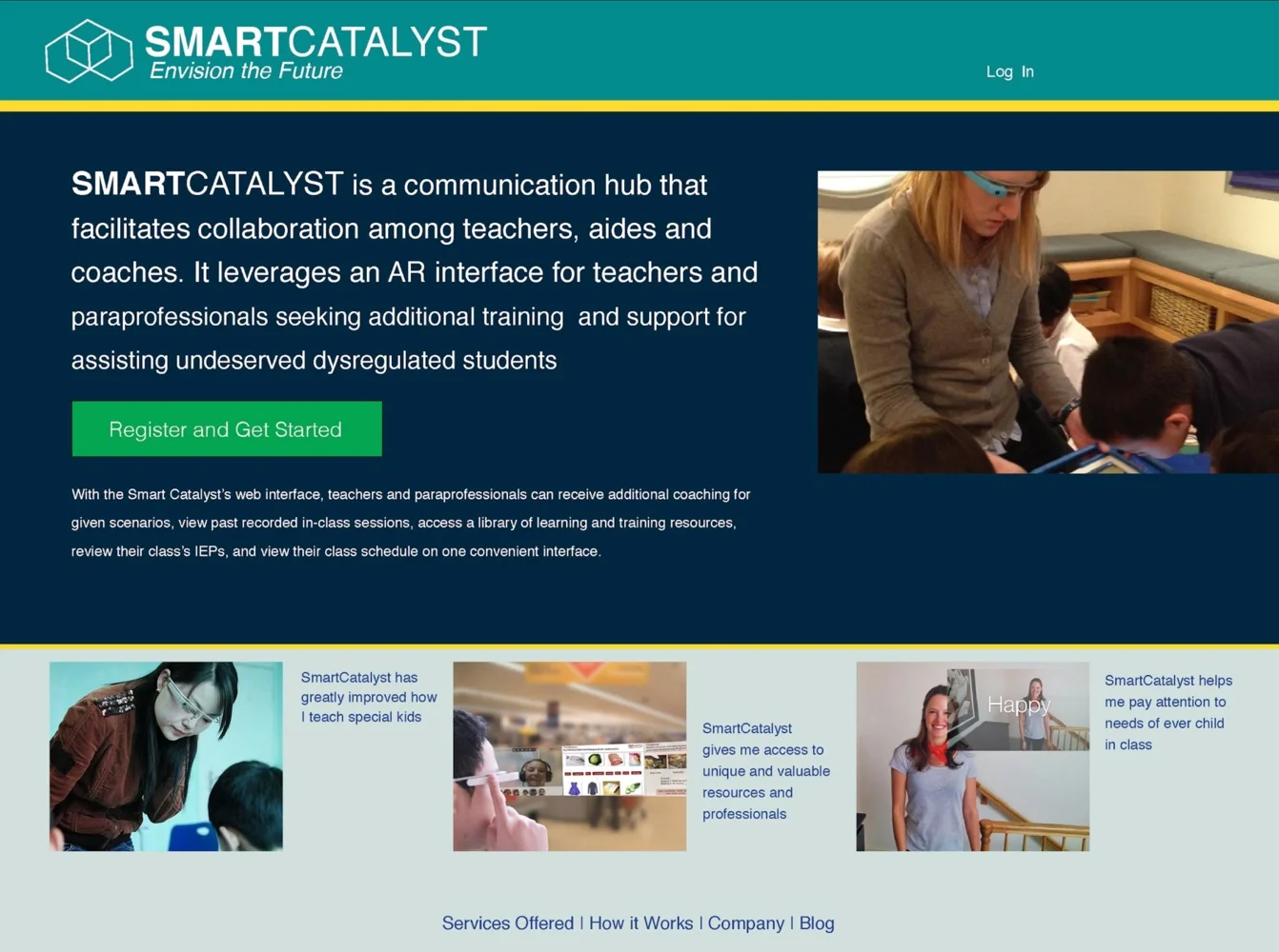
This led to the idea of “Smart Catalyst” - a smart-glass enabled learning management system (LMS) focused on addressing the needs of trainers and teachers who work with individuals with special needs.
Smart Catalyst would deliver AR-information and real-time coaching to support and “upskill” those who deal with populations such as young children, mentally ill, Alzheimer's patients, and elderly.
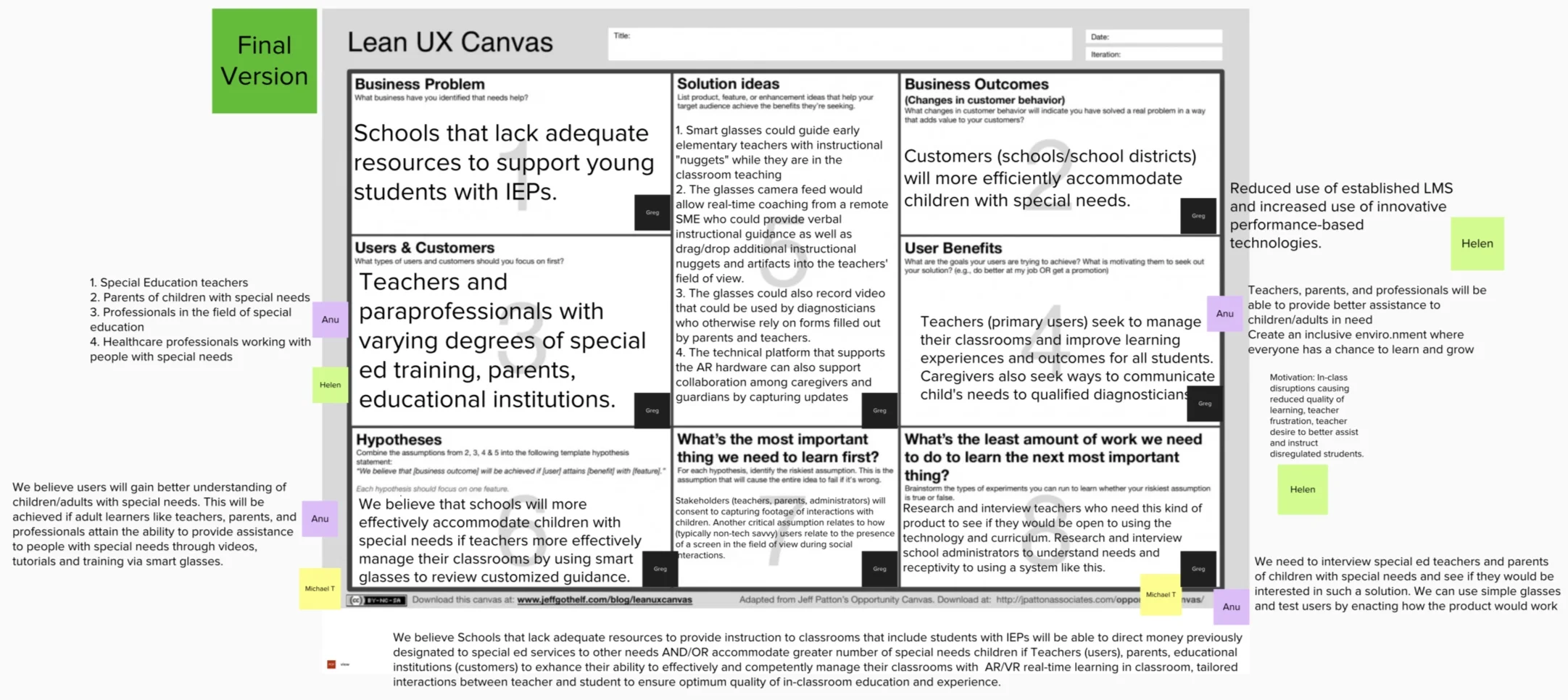
Lean UX Canvas
Define
We conducted various interviews with school teachers. Based on our interview results, we collaborated and created personas, empathy maps, and user stories.
Our team decided to create a low fidelity prototype of a website as the MVP and test it with potential users.
We also collaborated and worked together on Trello to create a Prioritized Backlog of all our work.

Ideate

To support our findings, we conducted discovery interviews with therapists, superintendents, special education teachers, parents, and aides.
We heard these individuals struggling with communication, time management, resources, and training in supporting disregulated students.
Based on the user stories we created a list of hypotheses and user journeys.
Prototype
With our user journeys mapped and our hypotheses established, we moved onto the prototyping phase.
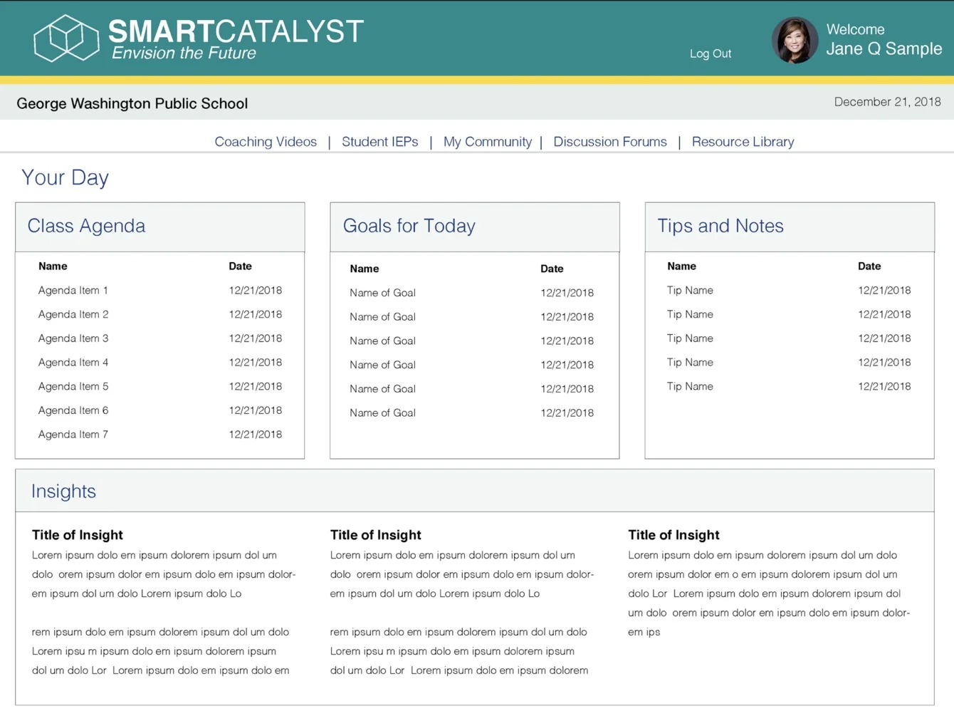
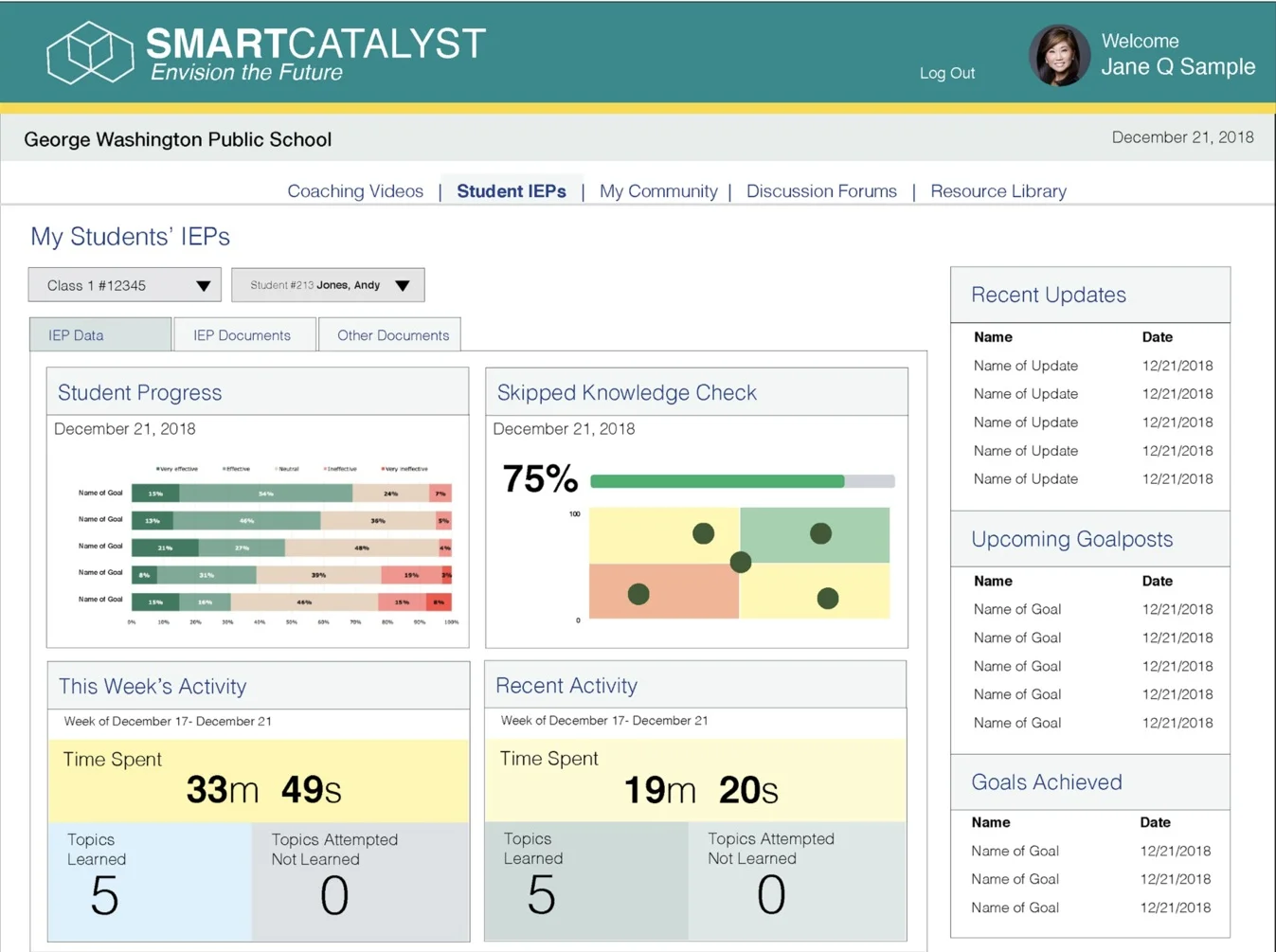
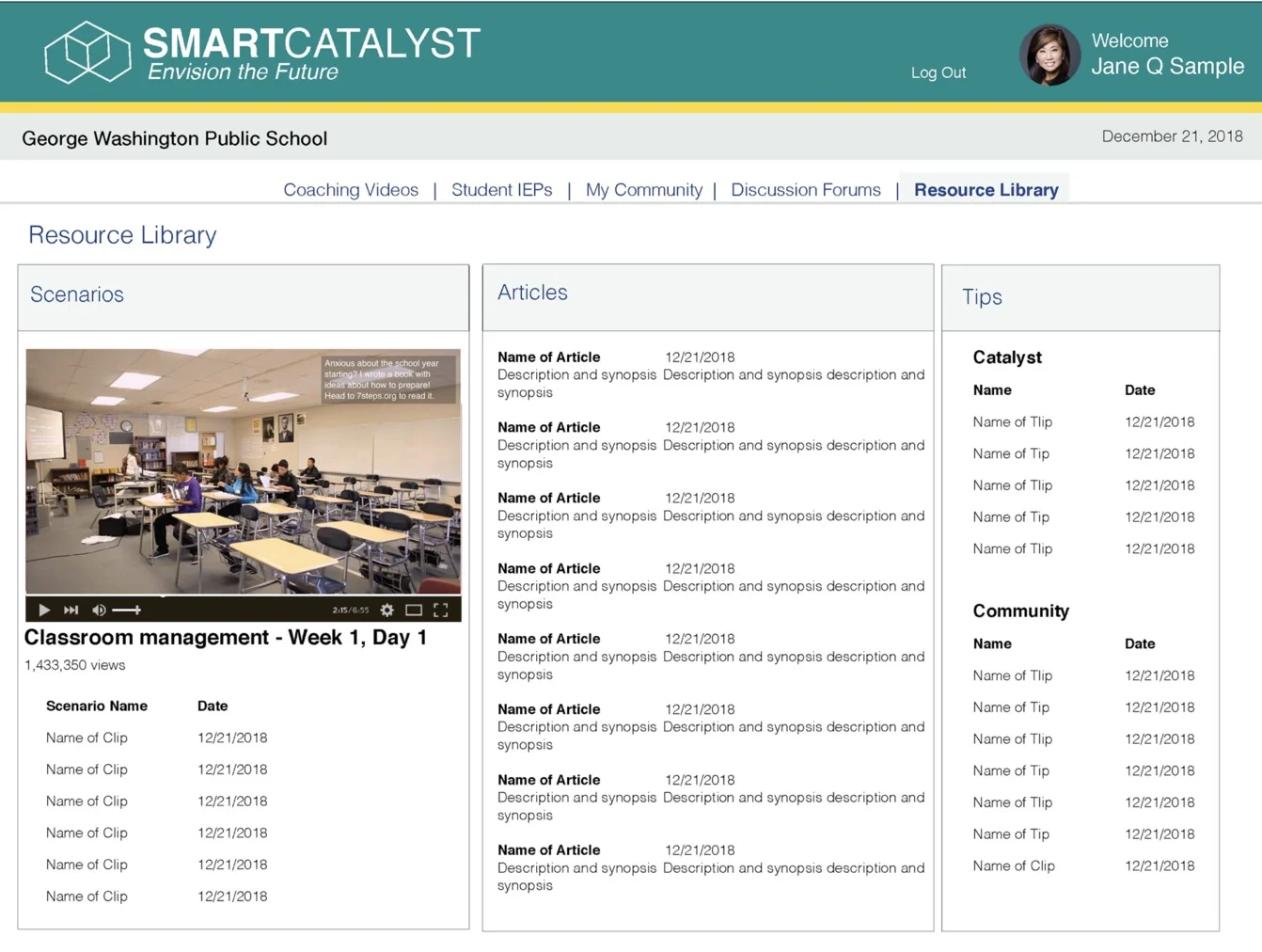
We created web interface mockups in Balsamiq, consisting of a landing page, home page, and 7 core pages.

Test
Two rounds of usability testing were conducted: the 1st round was conducted on the original prototype, the 2nd round was conducted on an iteration of the original prototype.
Round 1 yielded multiple critical insights: a desire for easier navigation, increased clarity and accessibility, and more thought given to security concerns.
To address these issues, in our second iteration we installed an easy-to-view navigation bar, reduced the amount of descriptive text where appropriate, added a description of security measures to our testing script, and removed 2 of the original 7 core screens.
Round 2 of usability testing generated entirely new insights yhst allowed us to fine-tune our product: addition of tags and filters for greater specificity, removal of 1 of the 5 remaining core screens, and fleshing-out of our most critical screen: the video log.
We created our final prototype following the analysis of the second round of usability testing data.